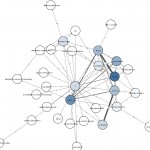
Understanding what are visitors doing on a website and how they are browsing that site is crucial for information architecture specialists. I’m using AWStats and Google Analytics to monitor websites. Nevertheless, I always felt that I didn’t see the whole picture. Recently I found how to view the stats from another perspective: graphs!
aiSee is a great piece of software, it’s a “graph browser which supports 15 layout algorithms, fast visualization of huge graphs, recursive graph nesting, easy printing and export of graphs to various formats”. In the Applications section I found Apache2GDL – a Perl script that generates visitor movement graphs from Apache log files. It parses the access.log file and produce a *.gdl file for aiSee.
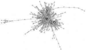
Let’s give it a try, below is the result graph for the log file taken from www.cnaa.acad.md.
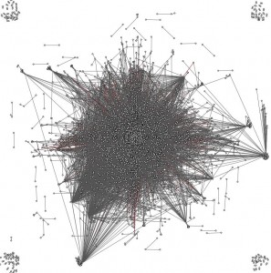
Huh, what an ugly image! There are so many edges that connects nodes because there are a couple of nodes that are connected to an enormous number of other nodes. After examining the graph image (the graph is interactive, you can zoom in/out and display information for a node) and the access.log, I found the nodes with many connections:
- page hits from search engines: a single node (the search engine) has connections with a lot of other nodes (website pages)
- site hits without a referrer result in a picture as in N.1. (Search engine crawlers and some download managers do not provide a referrer)
- it turns out that there are special (popular) pages that are connected to almost all other website pages. In my case, an example of such page is Site Search.
Notice that the graph displays all it finds in the access.log file except hits from search engine crawlers (the Apache2GDL script was written back in 2005 and may not catch all the crawlers). Said that, you should remove from your log file all the *.css, *.gif and whatever files your don’t want to appear in the graph. In my case, this procedure was already accomplished by Apache itself: I configured it to exclude some files and IP addresses from logging. Here is how to do it:
SetEnvIfNoCase User-Agent “SomeGreedyBOT” skip-log
SetEnvIf Request_URI “\.(gif|js|css|css|ico)$” skip-log
SetEnvIf Remote_Addr “192\.168\.0\.1” skip-log
…
CustomLog /var/log/access.log combined env=!skip-log
Let’s remove the hits without a referrer and hits comming from other domains except the website domain itself (www.cnaa.acad.md):
> grep -v ‘ “-” ‘ new.log > new2.log
> grep ‘http://www.cnaa.acad.md’ new2.log > new3.log
> sed ‘s/http\:\/\/www\.cnaa\.acad\.md//g’ new3.log > new4.log
The first grep removed NoReferrer hits, the second one selected only those lines that have a “www.cnaa.acad.md” substring, thus excluding all hits from other domains. The ‘sed’ command was used to remove the domain name from the log file. This was done because for Apache2GDL the URL’s ‘http://site.com/page.html’ and ‘/page.html’ are NOT the same.
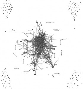
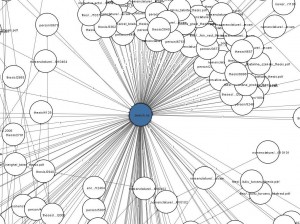
Well, Fig2 has less noise in it, but not very useful. I’ll just mention that the few nodes we see at the corners represents the short time user sessions after they enter the site from a search engine result page. Let’s see what happens in the middle of the graph: zoom in and see which node has the most edges:
We can see that ‘search.ns’ node have a lot of connections. This proves that the search facility is frequently accessed. By already knowing how useful the search is, we can exclude the hits to/from search.ns in order to have a cleaner picture of how users are browsing the website. But, instead of excluding nodes, we can go another way: we can group multiple nodes based on some criteria thus reducind the number of edges. In our case, the grouping will be according to website categories. The biggest categories of www.cnaa.acad.md are ‘Theses’ and ‘Scientists’. All url’s that starts with ‘/theses/’ is a navigation page that finally leads to a thesis page. A thesis page has the following format: ‘/thesis/nnnn/’ where nnnn is a number and represents the thesis’s id. There are a lot of theses nodes in the graph that just clutter the graph. By replacing ”/thesis/nnnn/’ addresses with ”/thesis/’ we’ll group all nodes into one. Also url’s of the form ‘/person/nnnn/’ that denotes a scientist’s page will be replaced by ‘/person/’.
> sed ‘s:/thesis/[^/]\+:/thesis:g’ new7.log > new8.log
Notice the [^/]\+ in the sed regexp that means “one or more char that is not a slash”. You see that the + sign is preceded by \. This is different from the perl version: [^/]+.
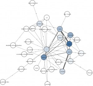
That’s better! It’s obvious that grouping criteria is site specific. To obtain a nice graph you need to know the url architecture of the website (because urls are the only info you can get from access.log files). If a website is well structured and has a hierarchical url architecture, you can group by the uppermost two or three folders, i.e. change ‘/xxx/yyy/zzz/whatever/…/’ to ‘/xxx/yyy/zzz/’. Control the granularity level by adjusting the folder’s depth. Here is the regexp that pertains the first two levels ‘/xxx/yyy/’:
sed ‘s:/\([^ /]\+\)/\([^ /]\+\)/[^ “]\+/:/\1/\2/:g’ new10.log > new11.log
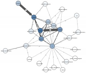
I’ll make another “node grouping” iteration:
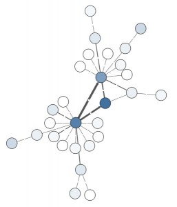
The graph has become readable now. But I see one more adjustment that can improve readability. Why to display “weak” edges? Let’s hide those edges with values that are 4 or less. I modified the source of Apache2GDL and added a simple IF check that excludes the unimportant edges. Ah, and I also excluded nodes that have only a few edges.
By the way, you can try different layout algorithms. Although, forcedir is best suited in our case.
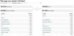
At the beginning I mentioned Google Analytics. It offers a couple of useful reports: Navigation Summary, Entrance Paths, Entrance Sources, Site Overlay. Below is a screenshot of the Navigation Summary report. I think graph visualization will be a nice complementary tool. The aiSee has a self-explanatory motto in this respect: “A picture is worth a thousand words”.
I described just one scenario of how graph visualization can be used in apache log analysis. The intention was to create an overview report and see the whole picture, but the log file can be filtered to create some biased graphs. Apache2GDL already have an URL based filtering option: “The URL pattern should be set to the name of your domain (example.com) or a particular directory within that domain (example.com/something)“. (Remember that we had removed the domain name from the log files for our report).
Apache2GDL is a simple script, but it’s just a proof of concept. It can be improved by adding filtering options:
- IP ranges – for example to create graphs based on geographical location (compare the usage stats by country)
- the number of connections an edge represent – the noise level can be greatly lowered by removing unimportant edges.
- Color groups – different colors can be associated to the sections of a website based on URL pattern matching. You have to zoom in the graph if you want to find what page a node represent. It would be far more informative to color the nodes.
In conclusion, I’ll emphasize that drawing a nice graph is a site specific task. The intention of this article was to give your an incitement. A graph representation is usually self-explanatory and is well suited for presentational purposes. The information should be presented in a way that will enhance the assimilation by the audience.
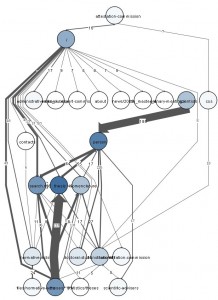
P.S. I’ve tried to apply the “noise” filtering (edge&node removal) before grouping nodes. It should mark out single web pages instead of site categories. Here is how the graph from Fig 4. looks now:
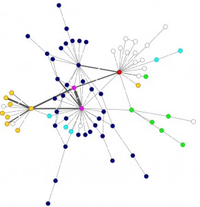
I also decided to change the color of the nodes depending on URL pattern. I really like the results: red: homepage, blue: theses section, yellow: scientists & doctoral students, green: normative acts, magenta: the search page and the nodes that represent all thesis’s pages (the blue ones are navigational pages). White nodes are pages we are not interested in. I’ve also reduced the node’s size.
“Notice the [^/]\+ in the sed regexp that means “one or more char that is not a space”. ”
… you certainly meant “not a slash”, instead of “not a space”.
Ah yes, you’re right: “not a slash” 🙂 I’ve corrected it. Thanks Bernhard.